
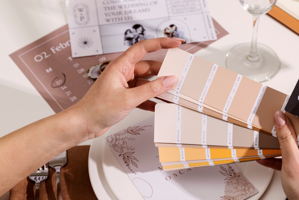
In the realm of hospitality, crafting an enchanting ambience is paramount to delivering guests an unforgettable experience. A potent tool in the hotelier’s arsenal is the art of colour. By harnessing the magic of hues in hotel decor, one can effortlessly evoke various moods and emotions, thereby transforming spaces into alluring havens. In this insightful article by Ridhima Singh, the esteemed Founder and Principal Designer of Danza Del Design, we delve into the psychology of colours and explore how savvy hoteliers can strategically use colour Palettes to curate distinctive palettes that cater to every mood.
The psychology of colours has a profound impact on human emotions and behaviour in the realm of design. Delving deeper into the science of colours- bold hues like red and orange can stimulate appetite, making them perfect choices for restaurant areas. On the other hand, warm shades such as beige, cream, and taupe, as well as cool shades like blue and green, evoke feelings of calmness and tranquillity, making them ideal for spa settings and bedrooms. Neutrals, being versatile backdrops, complement various styles effectively. By grasping these concepts, hoteliers and designers can strategically curate colour schemes to elicit specific emotional responses from guests, transforming spaces into captivating havens that cater to diverse needs and create a lasting impression. Let us understand how these palettes and tones work for unique setups in distinct areas with specific purposes.
1. Energetic and Vibrant:
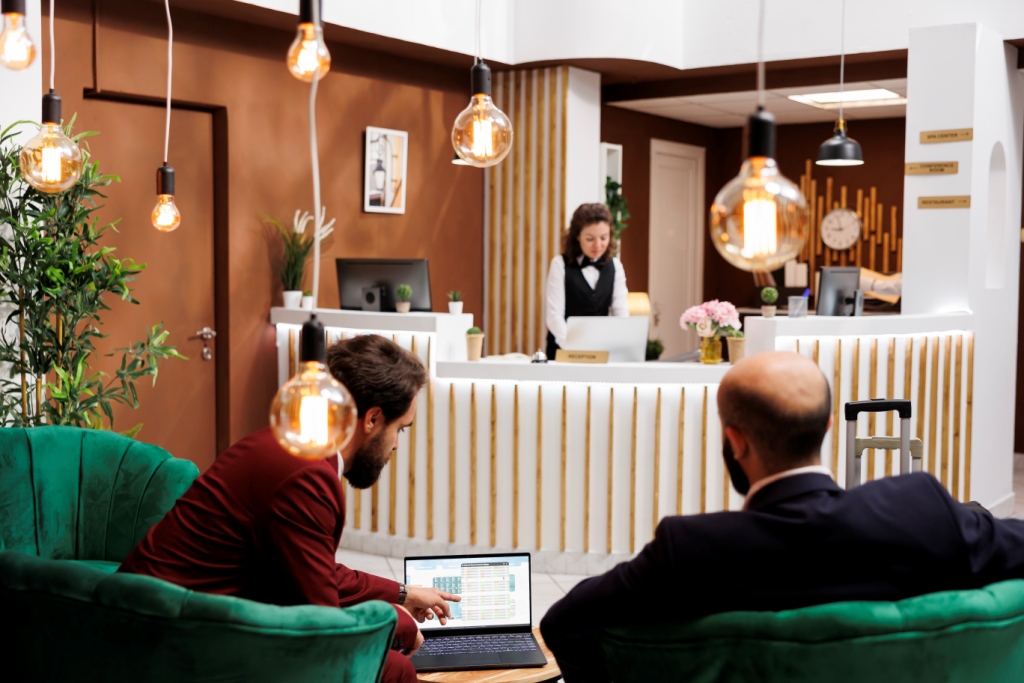
A captivating and lively range of colours, dominated by bold hues like electric blue, sunny yellow, and lively coral, can infuse the space with a tangible sense of excitement and dynamism. By strategically incorporating these tones in public areas such as lobbies and lounges, a vibrant and social atmosphere is fostered, encouraging guests to connect and engage with one another. The energetic ambience created by this palette is ideal for guests seeking a lively and vibrant stay filled with enthusiasm and meaningful social interactions.
2. Serene and Tranquil Palette:
In order to cater to guests seeking ultimate relaxation and tranquillity, a hotel can adopt a serene and tranquil palette. Incorporating soft and calming hues like pastel blues, gentle greens, and creamy neutrals throughout the rooms and common areas can transform the space into a serene sanctuary, encouraging guests to unwind and rejuvenate during their stay. This soothing atmosphere is well-suited for those looking to escape the hustle and bustle of daily life and wish to experience a peaceful retreat within the hotel premises.
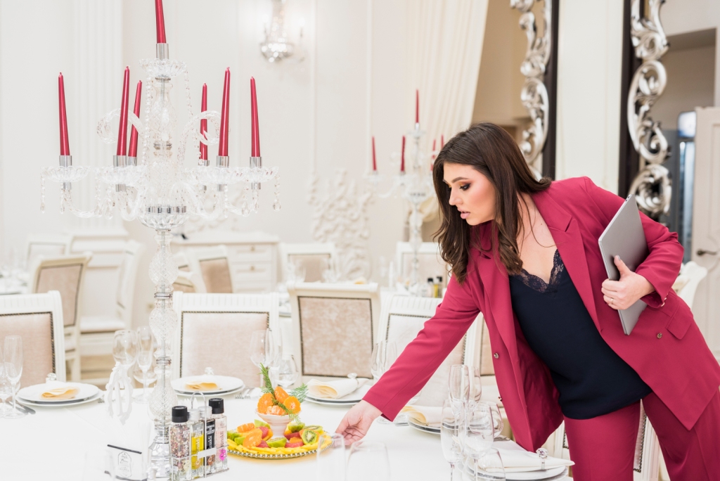
3. Timeless Elegance with Neutral Tones:
For hotels aiming to create a timeless and sophisticated ambience, a palette featuring neutral tones like beige, taupe, and ivory is an excellent choice. These classics never go out of style and exude a sense of understated elegance that appeals to a wide range of guests, including business travellers and couples seeking a romantic getaway. To elevate the overall design, tasteful accents of metallics or muted jewel tones can be integrated, adding a touch of opulence to the neutral backdrop.
4. Eclectic and Bohemian Chic:
For boutique hotels and trendy establishments, embracing an eclectic palette can be a thrilling and daring choice. Combining a mix of bold and contrasting colours, along with unique patterns and textures, the space emanates a bohemian chic vibe, inviting guests to explore their creative selves. This artistic and free-spirited atmosphere encourages a sense of individuality, empowering guests to embrace their creativity and indulge in an unconventional and inspiring stay.
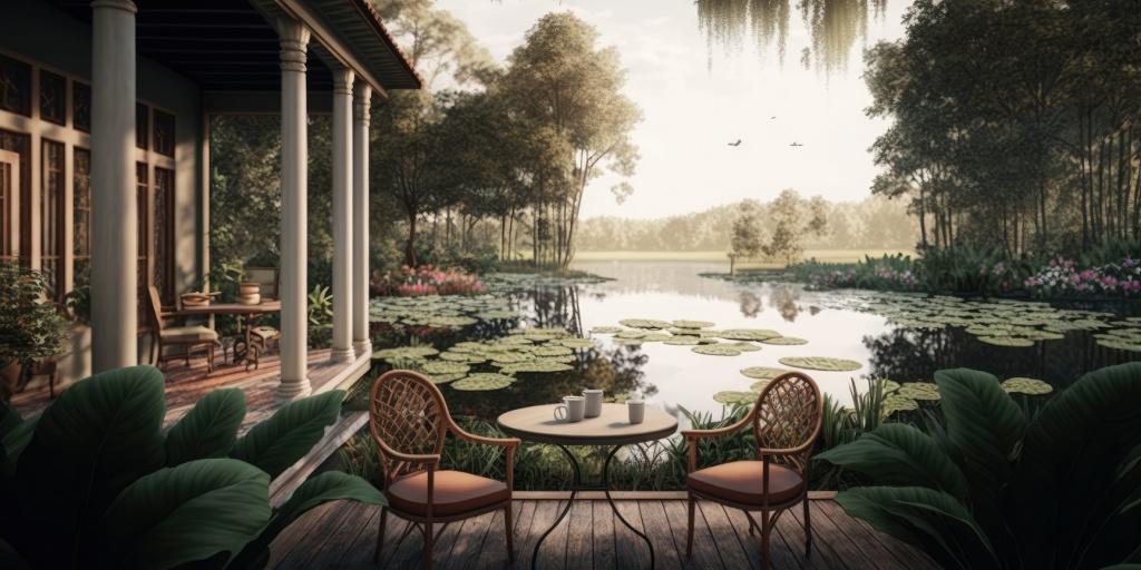
5. Nature-Inspired Palette:
Drawing inspiration from the beauty of nature, a hotel can create a harmonious and welcoming atmosphere through a nature-inspired palette. Deep forest green, warm terracotta and sandy beige can be used to bring the outdoors inside, establishing a solid connection with the natural world that promotes a sense of well-being. Guests will feel enveloped by the tranquillity and groundedness of nature, providing a nurturing and comforting stay.
6. Luxurious Jewel Tones:
For high-end hotels aiming to evoke opulence and extravagance, a regal palette with jewel tones is an ideal choice. Rich saturations such as amethyst purple, emerald green, and sapphire blue can be employed thoughtfully in decor and accents to create an aura of opulence and sophistication in such hotels. These pigments evoke a sense of royalty and splendour, appealing to discerning guests seeking a truly lavish and unforgettable experience.
The art of using colours in hotel decor is a skilful balance of understanding the psychology of hues and catering to the diverse preferences of guests. By thoughtfully curating palettes that correspond to different moods and atmospheres, hoteliers can elevate the guest experience to new heights. Whether it’s creating a vibrant and energetic vibe or a serene and tranquil retreat, the magic of colours in hotel decor can truly unlock the essence of hospitality spaces.

Shared By: Ridhima Singh,
Danza Del Design